StoryBee. A sweet experience.
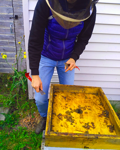
Building a brand for a small, local Apiary. We made a special visit to the hives and discussed all thing bees, honey and more. This is the beekeeper, Kristine, at work. Bees are so important and despite all their buzz, visiting the hive, is in fact, a very calming and beautiful experience. I brought my 9 year old son with me and he has a new found reverence for bees and their amazing world.
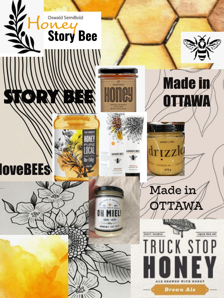
Moodboard exploration of theme for the honey label. Research and interviews with the client led to the selection of this moodboard.This mood was chosen for it's modern and edgy look with heavy contrast.
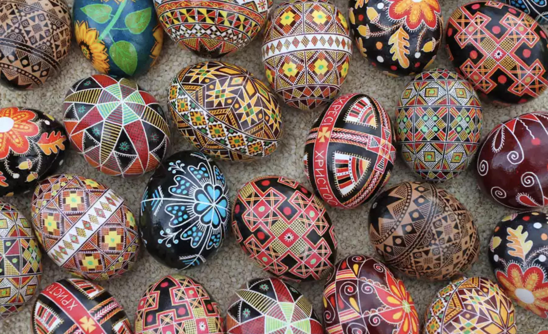
Inspiration and stories from the beehive. The beekeeper wanted to incorporate their Ukrainian heritage and story by representing the pansanky egg in the brand. The traditional Ukrainian Easter egg with exquisite patterns was very exiting to work with and gave this project a very unique touch.
Research has led to illustrative based brand that incorporates blocky text and the pysanky egg design.
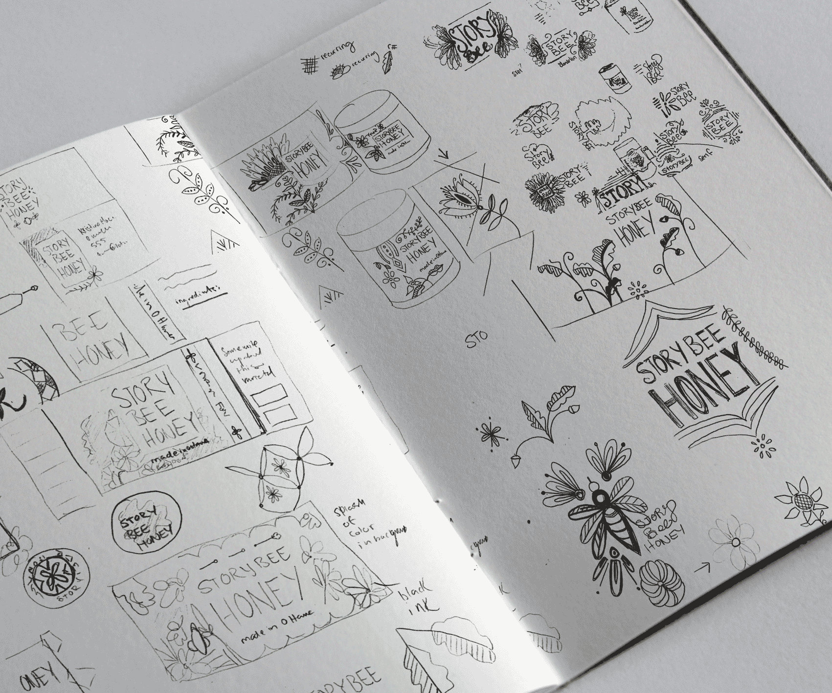
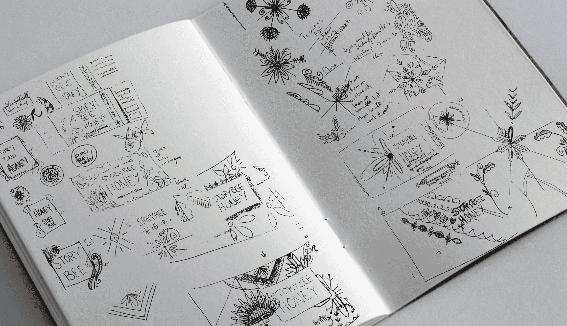
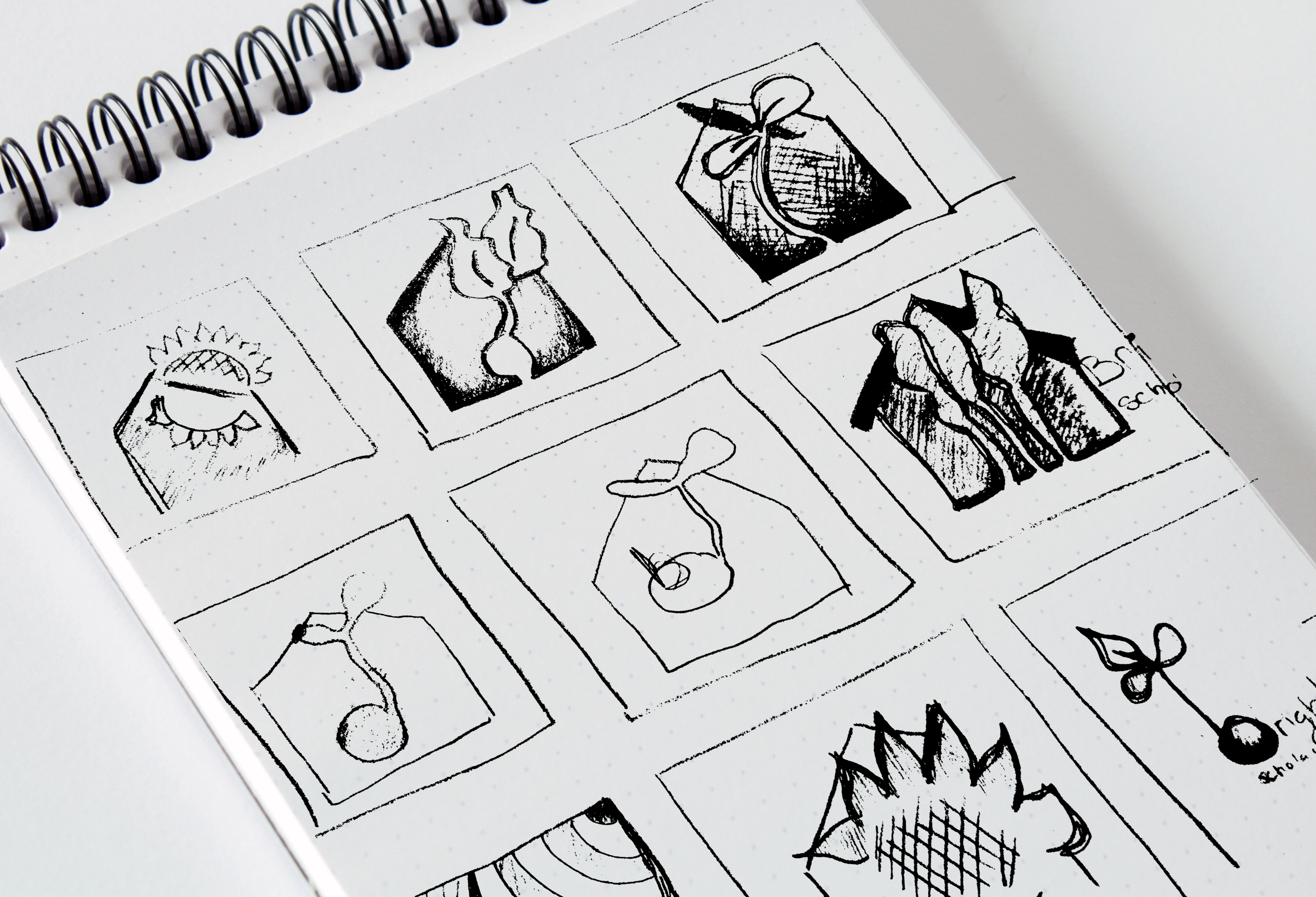
More sketches. I love sketches. I love this project.
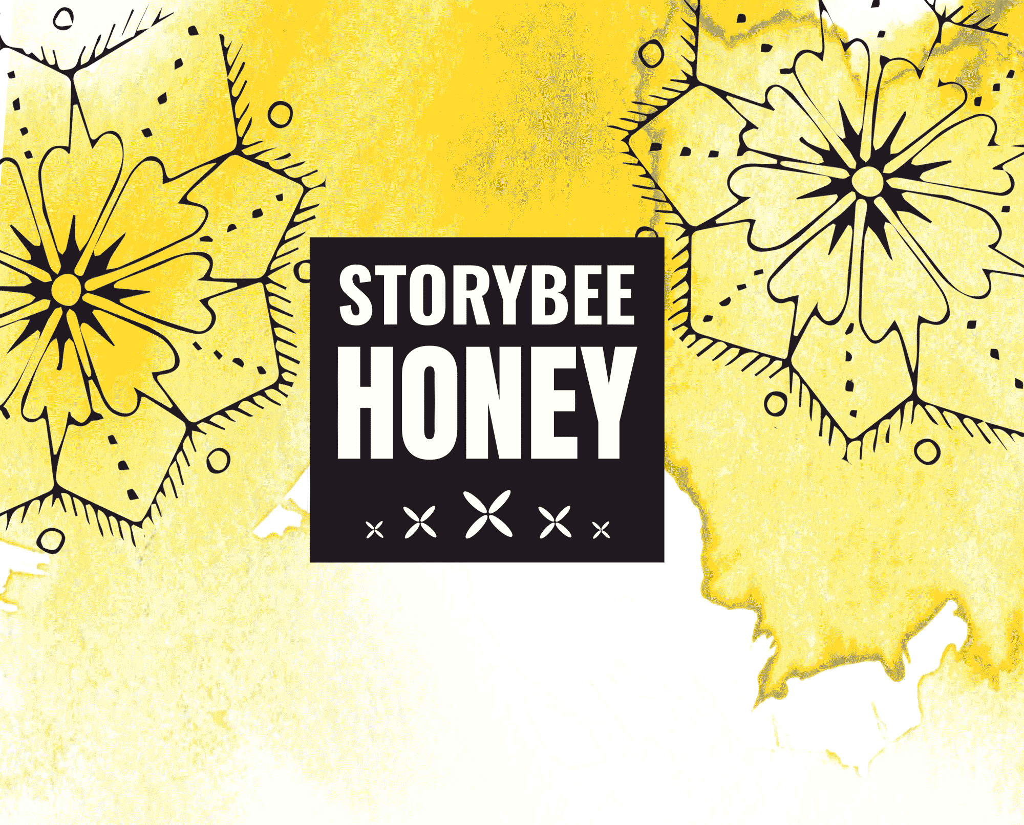
The original sketches and ideas came to this idea for the brand. Mixing the yellow watercolour with the hard black and blocky text. The brand feels modern and young. It also incorporates the flower pattern of the pysanky egg.
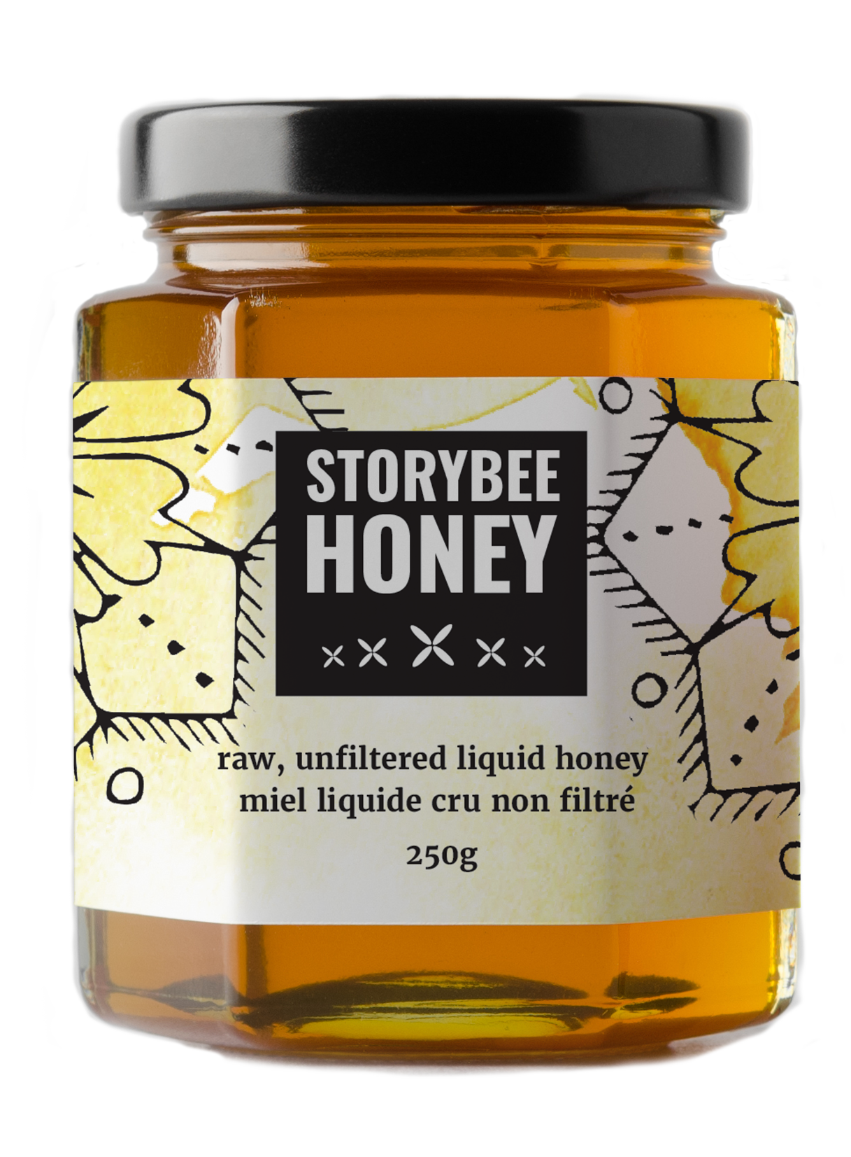
The label for the honey jars needed to incorporate all the pertinent information and of course comply with food regulation laws. There were some text that needed to be bilingual as well.
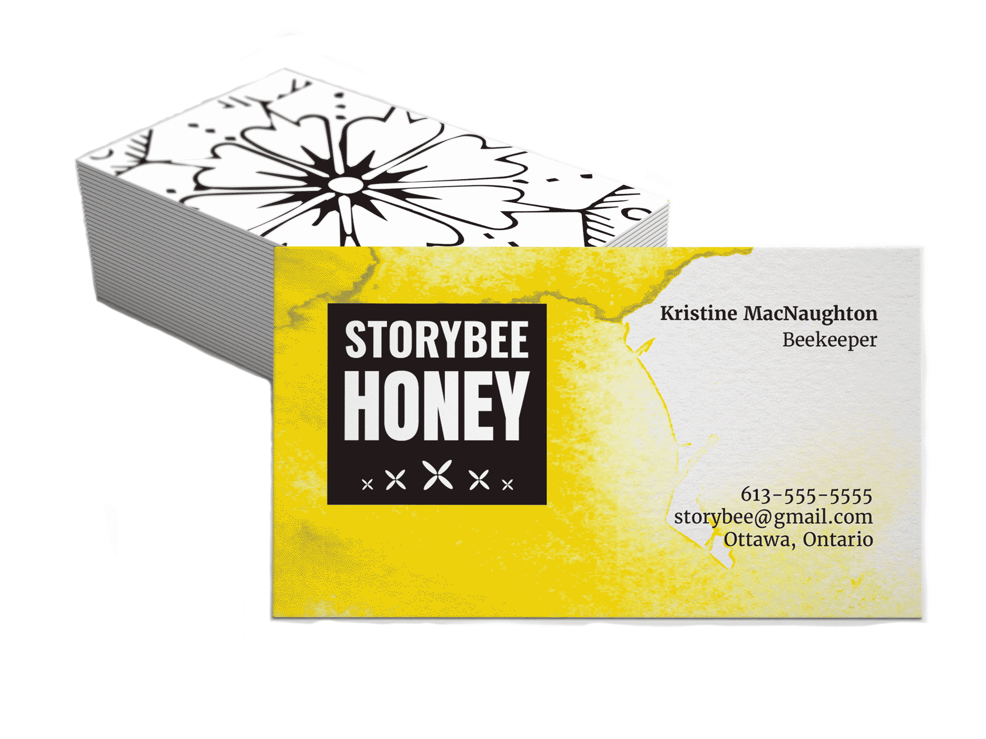
A card that incorporates the look of the brand, including a pysanky design on the back.
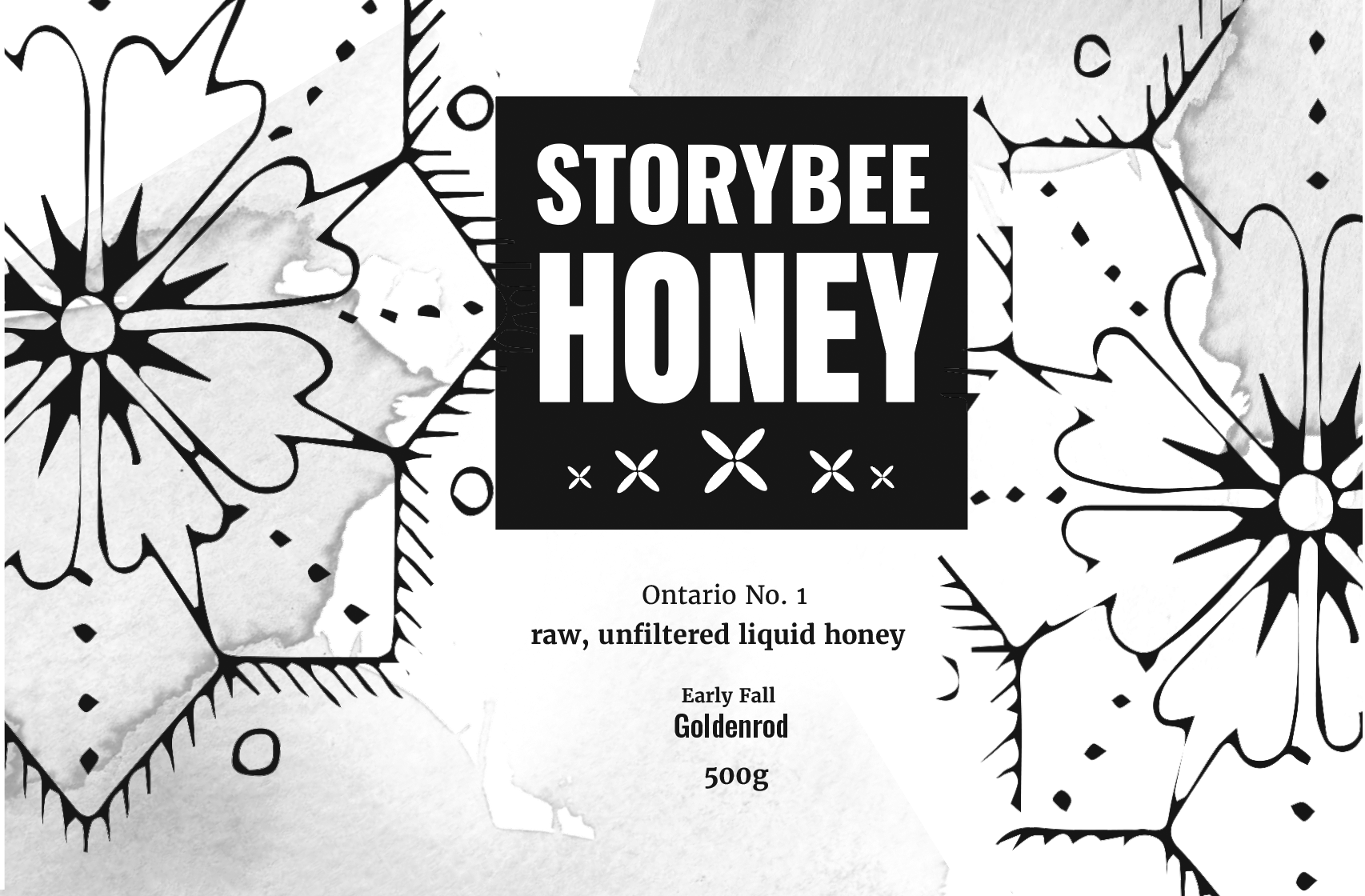
Different varieties and looks for the Storybee label. This black and white shows some of my process and roughts. I am overall very proud of this beautiful brand and I have developed a fierce admiration for honeybees.
Brand for a Charity Fund
The creation of bright and cheery logo for a community housing project in the Capital city. The sprout represents growth and opportunity, where the house represents the physical community and the home.
Process, interviews and research. All leading to sketches that demonstrated growth, hope, and the feeling of home.
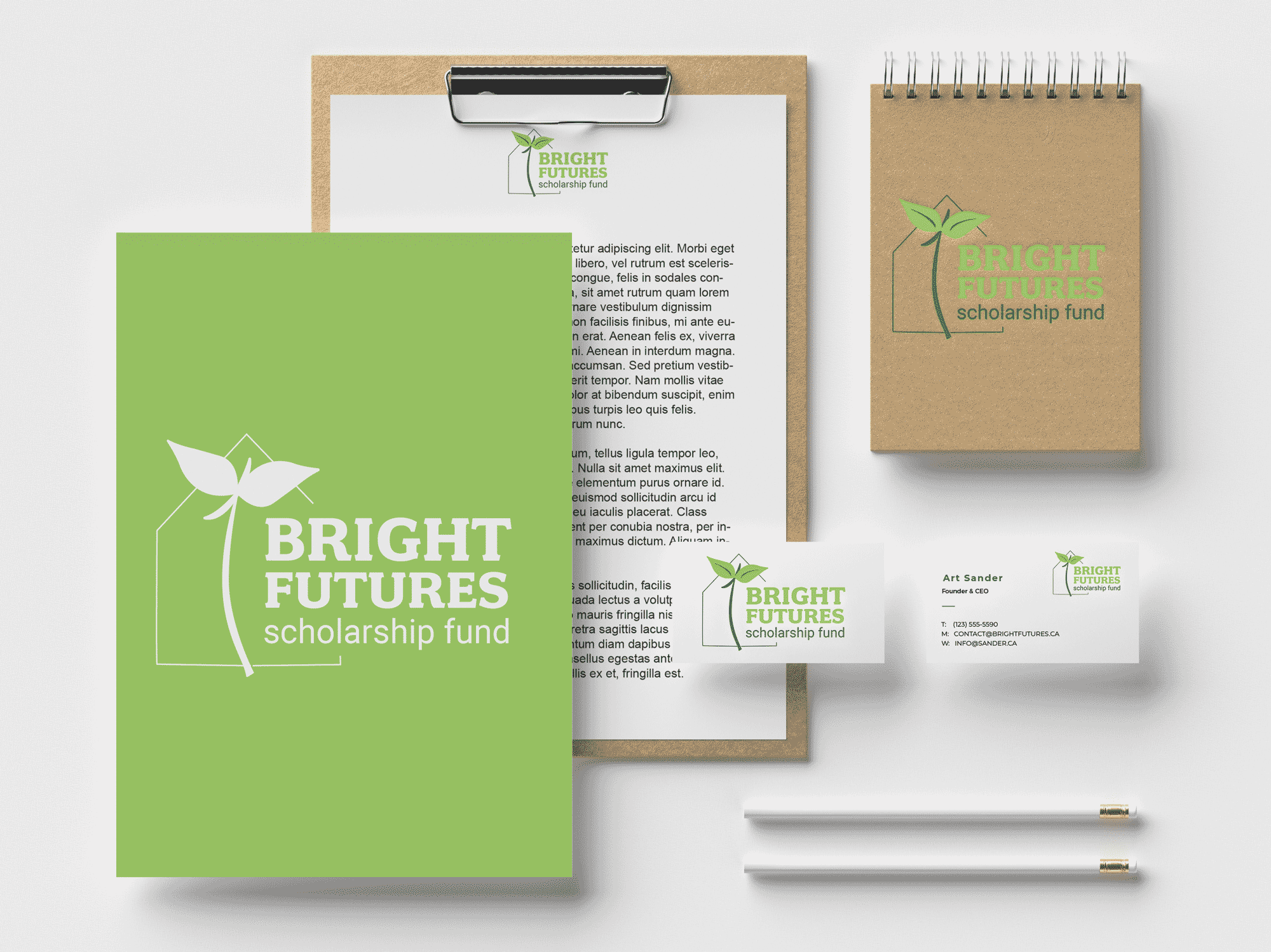
This logo incorporates the hope that this scholarship gives to people in this community. Green was used for the fresh and natural feel, while also representing a growing future full of promise through education.